✅ CSS Responsive Design with Media Queries – A Beginner-Friendly Guide
In today's multi-device world, websites must adapt to a variety of screen sizes — from mobile phones to large desktop monitors. This is where responsive design comes in, and one of the key tools for it is CSS media queries.
📌 What is Responsive Web Design?
Responsive web design ensures that your website looks and functions well on all screen sizes and devices. Instead of building separate sites for mobile and desktop, responsive design allows a single site to automatically adjust its layout and content using CSS.
🧠 Why Use Media Queries?
Media queries are CSS techniques used to apply styles conditionally based on the screen’s size, orientation, or resolution. This makes your website flexible, user-friendly, and mobile-ready.
🔧 Basic Syntax of Media Queries
@media (condition) {
  /* CSS rules here */
}
Example:
@media (max-width: 768px) {
  body {
    font-size: 16px;
  }
}
This rule means:
“When the screen width is 768px or smaller, apply this style.”
📱 Common Media Query Breakpoints
| Device Type | Common Breakpoint |
|---|---|
| Mobile | max-width: 480px |
| Tablet | max-width: 768px |
| Small Laptop | max-width: 1024px |
| Desktop | min-width: 1025px |
You can use these to create adaptive layouts.
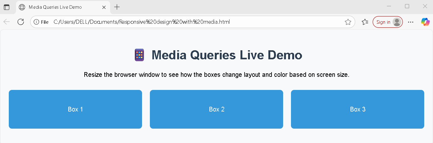
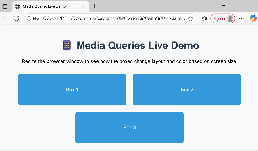
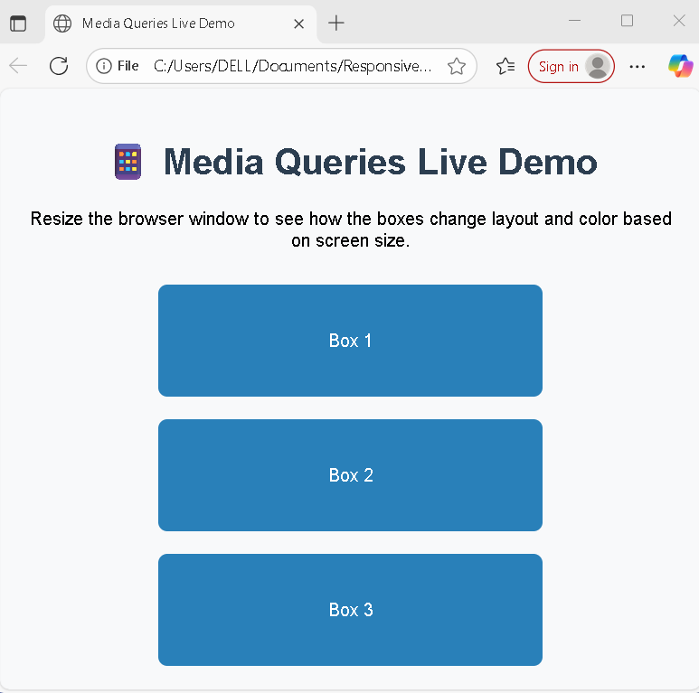
🧱 Example: Responsive Layout with Media Queries
✅ What it does:
- On large screens, boxes are 3 in a row.
- On tablets, they become 2 per row.
- On mobile phones, each box takes full width.
🎯 Benefits of Media Queries
- ✅ Improved user experience on all devices
- ✅ Better SEO (Google prefers mobile-friendly sites)
- ✅ One codebase for all screens
- ✅ Easier maintenance and updates
⚠️ Common Mistakes to Avoid
- ❌ Using fixed pixel widths instead of percentages or
flex - ❌ Ignoring small devices during design
- ❌ Not testing across real devices or emulators
- ❌ Writing repetitive or unorganized media queries
🧩 Pro Tips
- Use
emorremunits instead ofpxfor scalable typography - Combine Flexbox or Grid with media queries for powerful layouts
- Keep media queries organized and grouped logically
Learn More
✅ Conclusion
Media queries are essential for creating responsive websites that work seamlessly across all devices. By learning how to use them effectively, you can build flexible, future-proof layouts that adapt to your users' needs — whether they’re browsing on a phone, tablet, or desktop.